
Habitica: Stoic Mode


Project length: July 13 - August 3 (Roughly 3 weeks)
Position: UX Researcher & UI Designer
Project Objective: Design a focus feature to add to the productivity app called Habitica
Programs used: Figma, Optimal Workshop, Google Office
Introduction
Background
With the rise of social media, our level of productivity has declined. We are getting so distracted by reels, shorts, and clips and as a result, our work suffers. I use the app Habitica for daily tasks, goals, etc. I’m very fond of this app because of its gamification aspect. However, I wished that it had some kind of feature that would help the user stay focused and complete their tasks.
Problem
How can we make Habitica even more useful for its users? Currently, it stands as a productivity app where you can create a list of habits and tasks for you to accomplish. You finish the task, you get a reward. But how can we go further than that? How can we further assist the users and prevent them from being distracted?
Research Goal
My goal was to see the existing focus apps. I wanted to see what about these apps made them so successful. What specific features about one app makes it stand apart from others? I wanted to find out what commonalities these apps had and what common frustrations or shortcomings people had with these apps.
Research Findings
I found that the most common focus apps were Freedom, Study Bunny, and Flora. There were a few other apps to consider, but the three aforementioned apps had the most downloads and ratings.
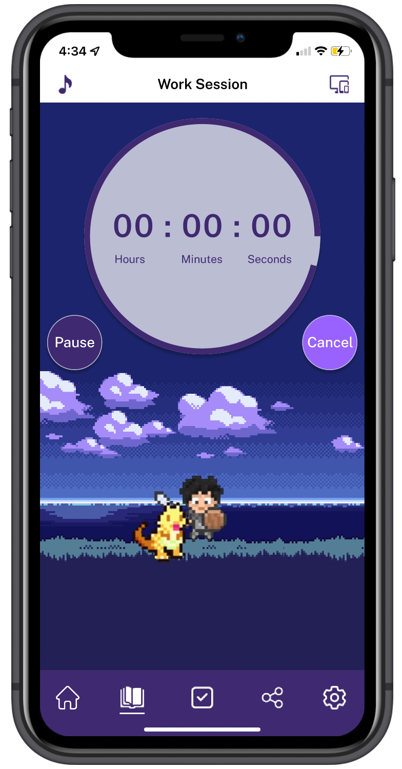
Almost all of these apps were centered around the Pomodoro Timer. Basically, it is the idea that we are most productive in timed sessions. You set a specific amount of time to do deep work then stop and you repeat if necessary.
I wanted to offer the user more than just a timer. I wanted my feature to be turned on as long as the user likes. I believe that everybody works differently and I wanted to offer an additional option if the Pomodoro Timer isn’t as useful for some users.

User Interviews
- In the interviews that I conducted, I asked my participants a series of 12 questions in regards to focus apps and each person’s idea of what productivity was. I was aware that everyone has different jobs and different tasks that they need to accomplish each day, so I was curious how my feature would be helpful for them.
- Most of my participants were recent graduates in the professional world. They either do their work at a computer desk or on a laptop. Majority of them admitted to having a high screen time usage and how social media has been a hindrance in their work.
- In terms of focus apps, a lot of my participants were looking for something that motivated them to complete their tasks, something that they can do together with friends (if possible), and something that would be efficient and hold them accountable when they are procrastinating.

Feature Roadmap
- After doing competitive research analysis and conducting interviews, I put together a feature list of some Must-Have’s and Nice-To-Have’s to refer back to when designing my ideal feature.

Creating User Flows
In terms of user flows, I wanted the process to be quick and easy. The users already have tasks of their own to do, they don’t need a complicated flow in the feature itself. The user would simply enter the focus feature, go through a few personalization choices, and then start their session. I felt that if the flow consisted of too many steps, it would discourage the user from using the feature in the first place.


Low Fidelity Wireframes
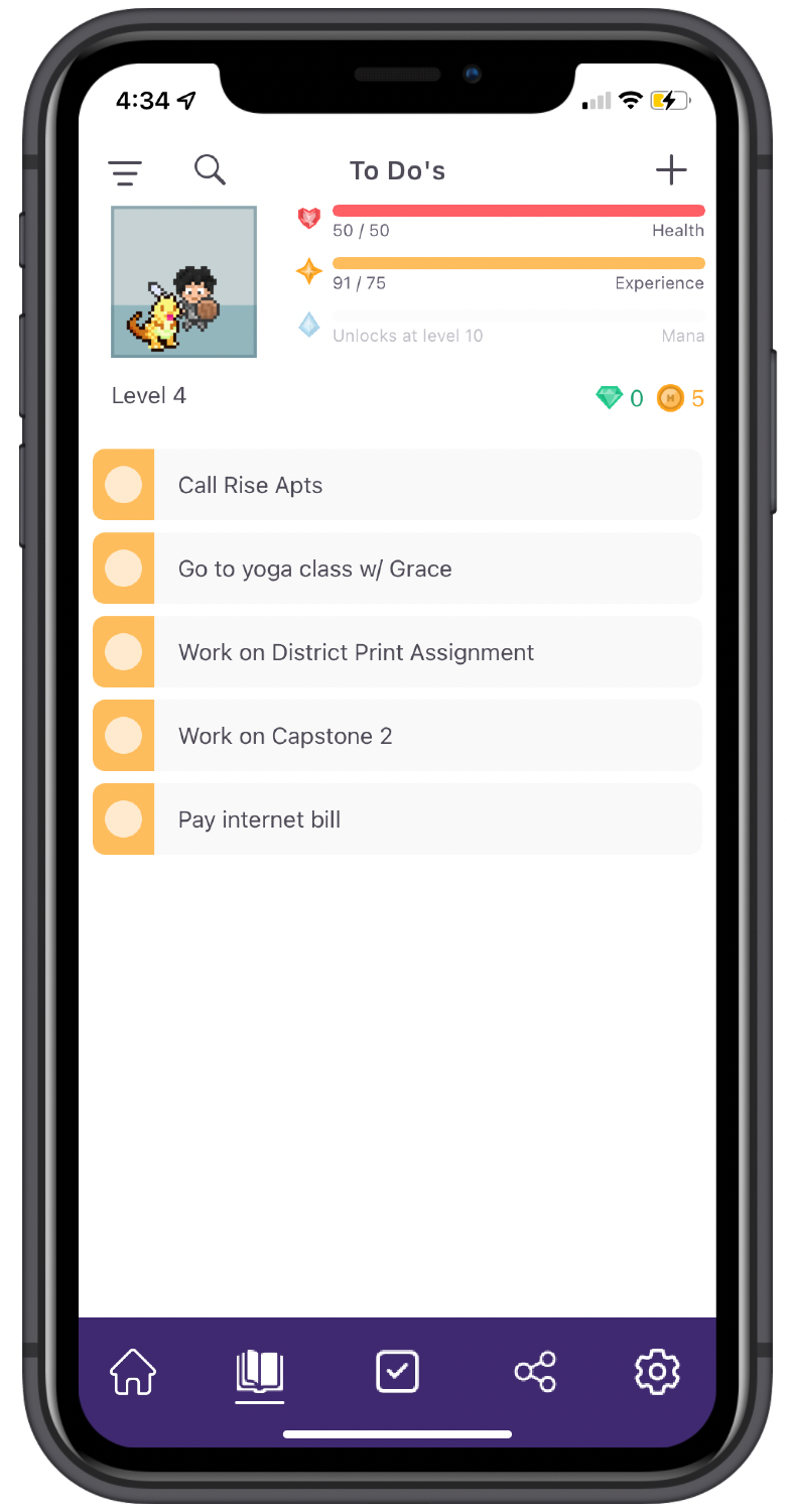
I then set out to work on the Lo Fi wireframes. I took a few screenshots of the app so I can stay within the confines of Habitica. I didn’t want to change too much or make any drastic altercations. I based a lot of the design off of the already existing UI elements of Habitica and a few of the competitor apps.

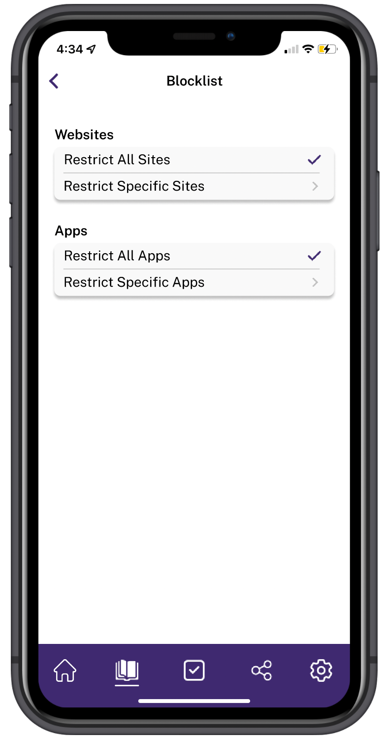
UI Design Elements
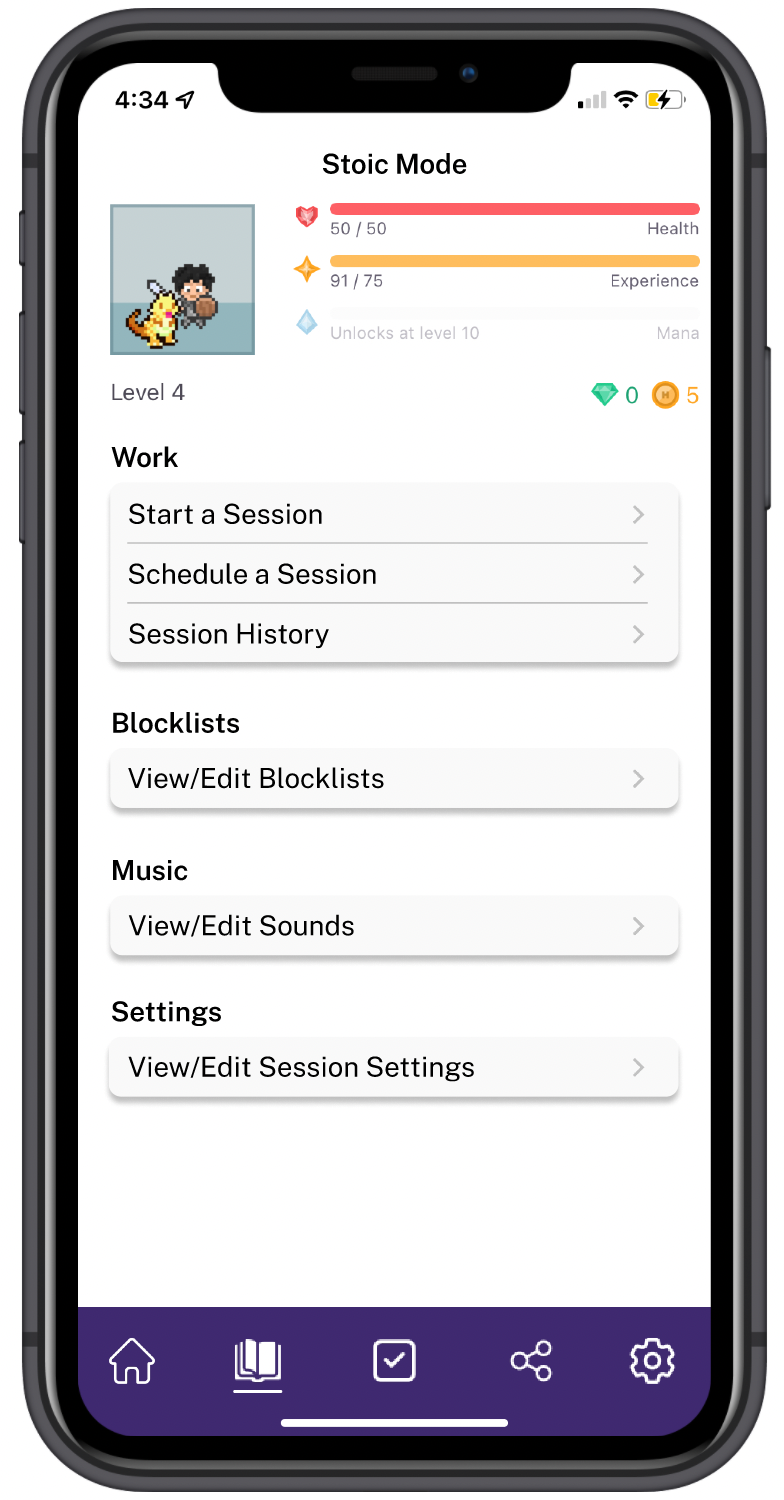
As I mentioned earlier, I wanted to stay within the confines of the already existent UI elements of Habitica. I didn’t want to make any drastic changes. I used similar color schemes, kept the same navigation style, and kept the button styles. I made a change to the bottom navigation bar because I needed to add an icon for my focus feature. While I was at it, I gave those icons a makeover.


Testing
So now, I had a series of Hi Fi wireframes that were ready for testing. I reached out to the participants that I had interviewed at the beginning of this project and asked if they were interested in testing our my feature.
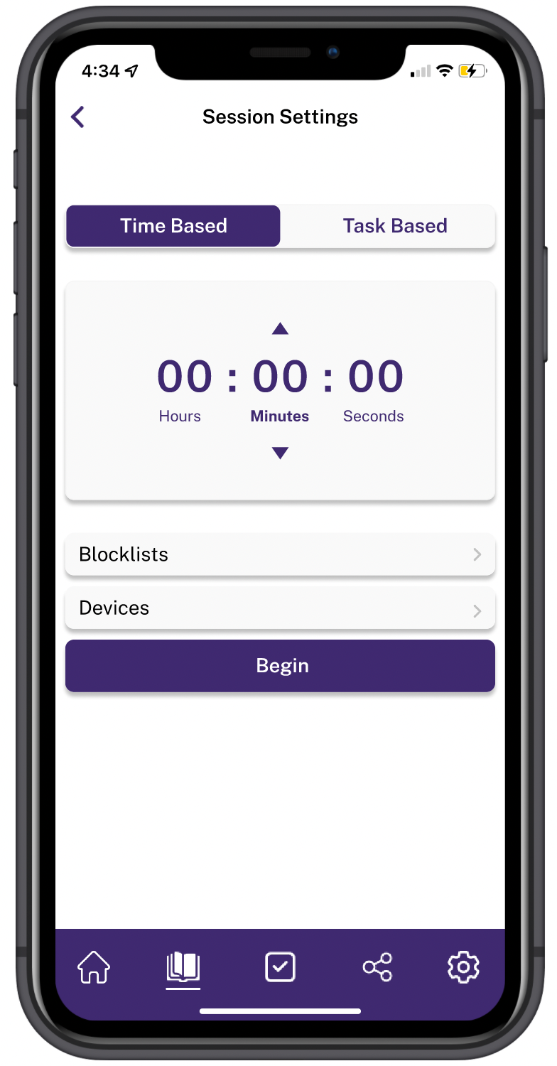
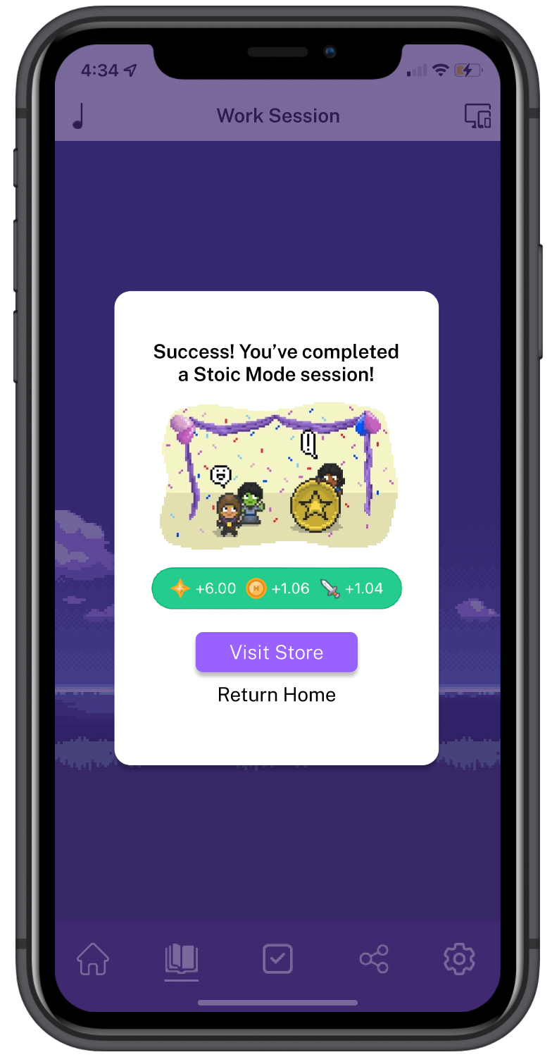
The participants were assigned 2 tasks. One task was to use the feature in a time-based mode. The second task was to use the feature in a task-based mode.
I had 3 participants partake in this testing process. They all were able to use the feature with little to no complications.
Iterations
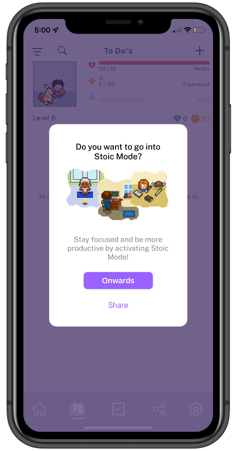
I need to make a few iterations before finalizing this feature. I wanted to call it Stoic Mode because I believe that it takes a true Stoic to be able to focus and concentrate on themselves in a world full of distractions. My iterations were minute, they were mostly aesthetic changes.

Final UI Product

Reflection
Personally, I am happy with the final result. I think that this can be something that would be useful for people out there that have trouble focusing on their work and staying productive.
I think there was definitely a lot to take away and learn from this project and I’ll certainly bring all of that with me and apply it towards my next project.